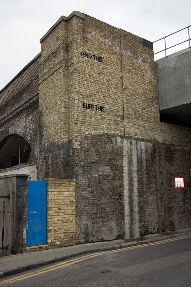
The Question Mark by mobstr, stage 1. Photo by mobstr.
mobstr likes to play games with people who remove street art and graffiti. I want to highlight two pieces from 2010 and 2012/2013 that did this particularly well. They are part of mobstr’s Progressions series. For these two pieces, mobstr returned again and again to a specific location where he knew that his work would get buffed pretty quickly with some poorly-matched paint, painting a stenciled phrase and taking a photo each time of his work and of the subsequent buff-jobs. He then collected all of those photos and sent them out together, with the finished piece really being about how the wall changed over time rather than how it looked at any individual moment.
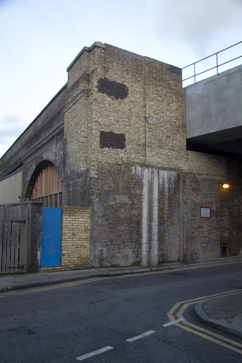
The Question Mark by mobstr, stage 2. Photo by mobstr.
In the 2010 piece, mobstr began by asking “Is this shade of grey acceptable?” in grey stenciled text. But the buffman deemed mobstr’s work unacceptable and painted over it. mobstr continued enquiring about various shades of grey in the same manner each time his question was painted over, but the buffman continued to remove mobstr’s work no matter what shade of grey he used (despite grey being the stereotypical paint color used to cover graffiti). The back and forth is one of the most brilliant “fuck you Mr. Buffman” artworks I’ve ever seen, mobstr was poking the buffman with a very clever stick.
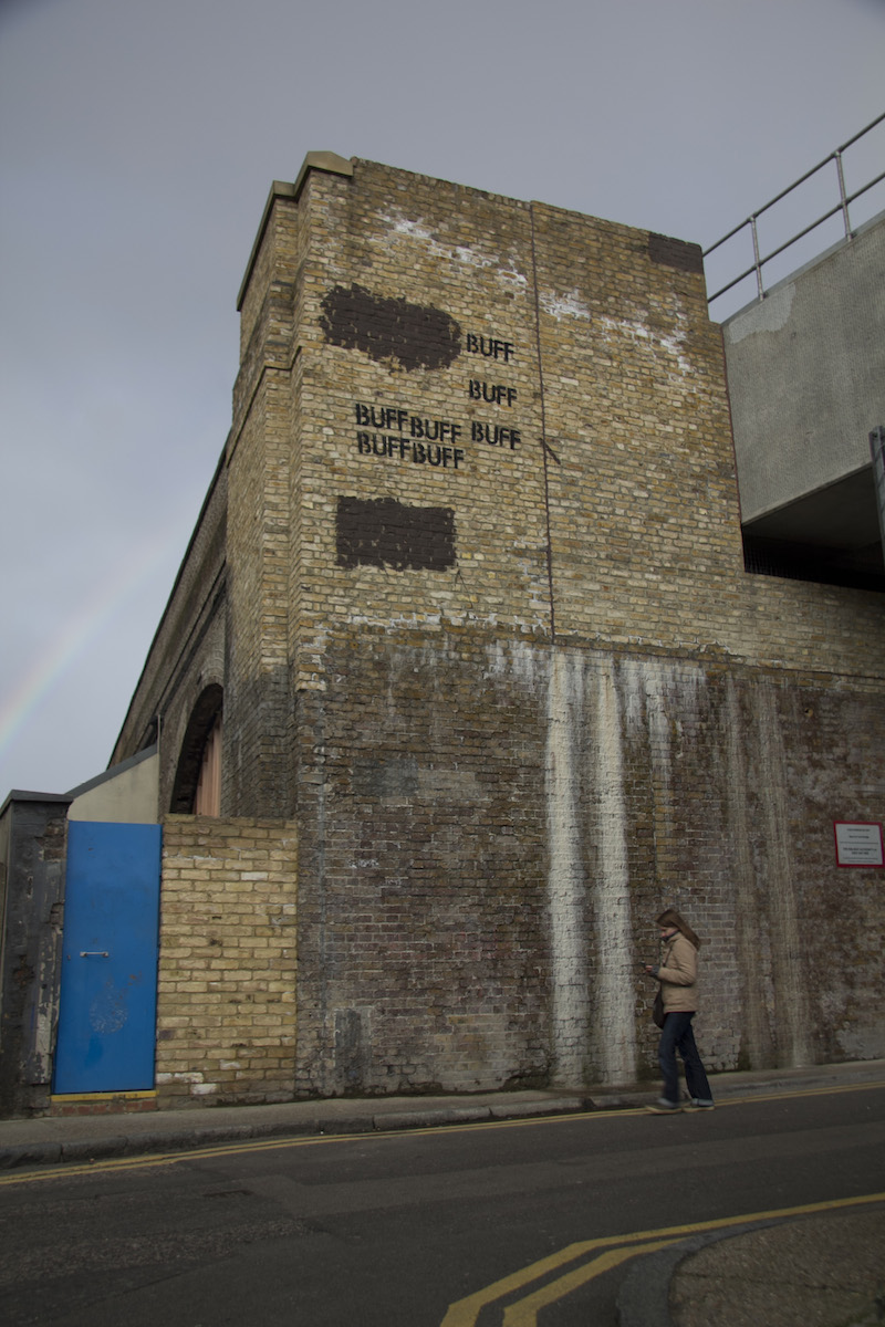
The Question Mark by mobstr, stage 3. Photo by mobstr.
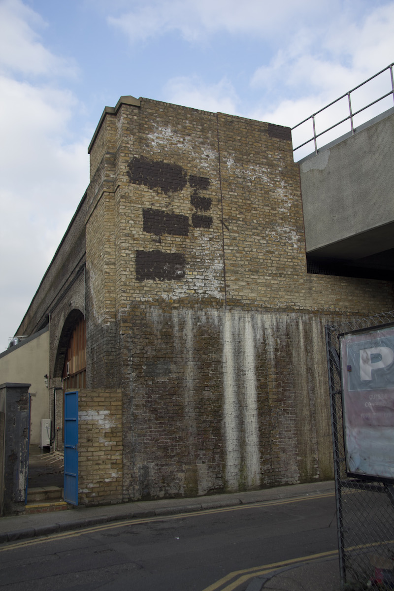
The Question Mark by mobstr, stage 4. Photo by mobstr.
In 2012, mobstr returned to the streets with a similar idea for The Question Mark. In The Question Mark, mobstr worked with the buffman to create a shape on a wall out of buff paint. That shape was, of course, a question mark. By painting small words suggesting where the buffman should paint over next, mobstr used the buff to paint something on the wall that wouldn’t be removed, since it would be made out of buffmarks. The buffman was covering street art, but he creating some in the process too. The piece began to take shape in October 2012 and was finally completed in July 2013. The end result is two-fold: In person you see can the finished question mark that is unlikely to be buffed, but to really see and understand The Question Mark, you need to see it online in a series of photos.
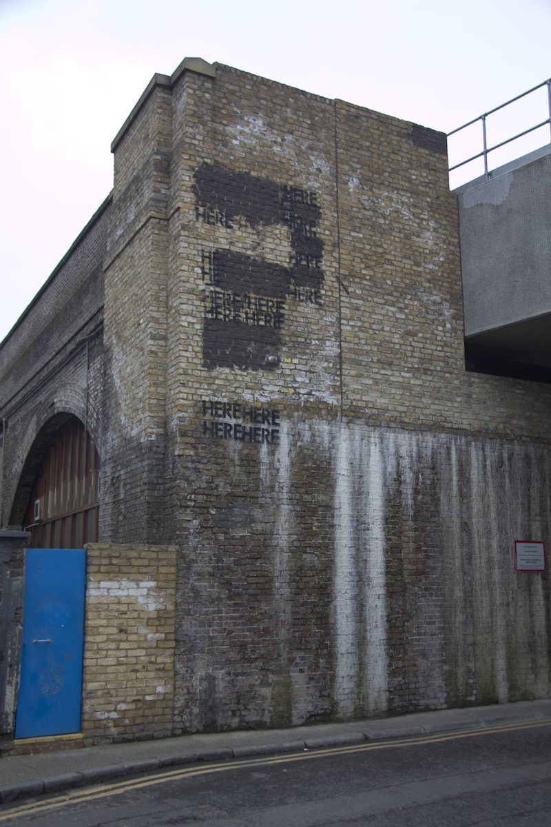
The Question Mark by mobstr, stage 5. Photo by mobstr.
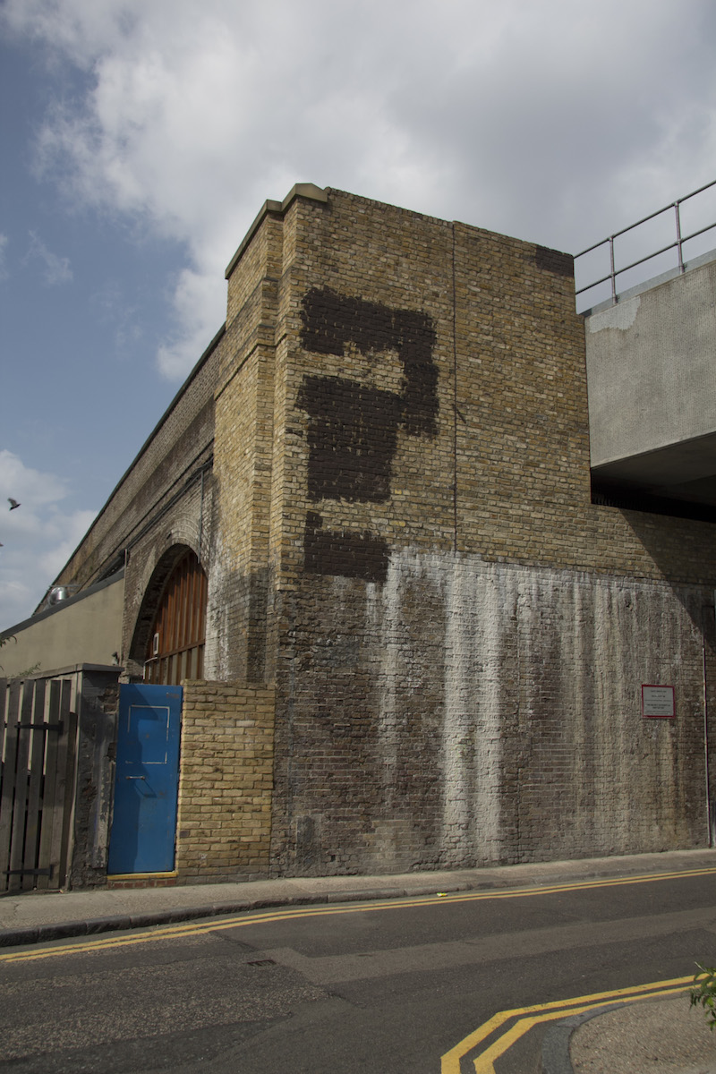
The Question Mark by mobstr, stage 6. Photo by mobstr.
The works in mobstr’s Progression series could be seen in person, and of course the buffman does see them in person, but most people probably don’t catch the entirety of the exchanges in person as they happen. And that’s alright. The pieces are designed to be seen online in a series of photographs rather than in person or as one photograph. I posted the shades of grey piece to Vandalog and it got so popular on StumbleUpon that it’s still one of the most popular posts on Vandalog some months, around three years later. Hundreds of thousands of people have seen it. mobstr would have had to paint the series on a billboard in the middle of New York City for a similar reach in the physical world. The internet didn’t make these pieces by mobstr possible, but it did allow for a situation in which they weren’t almost completely irrational to make.
In a similar vein to mobstr’s Progression pieces, Lush has made a handful of pieces that poke fun at the lack of relevance that geographic location now has for graffiti. Writers can paint pieces in their backyards or abandoned factories and get more views of the work than if they paint at a local hall of fame spot, so long as their pieces are well-documented and well-distributed online. Lush’s method of pointing this out is seen with Why dont you just go home…, a piece that physically consists of 12 throw-ups presumably painted in different locations. Each piece was photographed and those photos were stitched together into one image to read “WHY DONT YOU JUST GO HOME AND DO IT ON A CANVAS”.
As I wrote on Complex.com, “With stitched-together pieces like this one, Lush had made work that exists in the physical world, but really makes no sense there. Any one of those words seen individually wouldn’t even make sense as graffiti, since it’s not a name or a slogan or anything really meaningful. It would just be a random word. Put together though, the complete piece is hilarious… Lush has modified what he does on the street so that it is best viewed online instead of in the flesh.”
Why dont you just go home… certainly exists on the street, but it is incomplete there because it’s unlikely that anyone would ever see the complete sentence and put it together. It take documentation and online distribution for it to make much sense for artists to create these kinds of multi-part pieces. Another piece by Lush in the same vein asks “WHAT EVER HAPPENED TO STREET ART ON THE STREET”. Lush’s examples intentionally take things to an absurd extreme, but there’s no reason that non-absurd works can’t be made using a similar method, or absurd pieces where the absurdity is not a critique of the method.
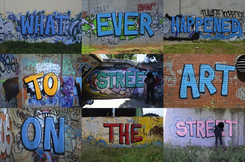
What ever happened by Lush. Photo montage by Lush.